|
Name:alyssa Self Evaluation
Its neat but the paint could have been done better
Painting it
Yes, I think the red and greenish color went well together.
All but the bottom
In a sculpture you can actually see the proportions better and its slightly easier to fix your mistakes because you can easily just remold part of it.
0 Comments
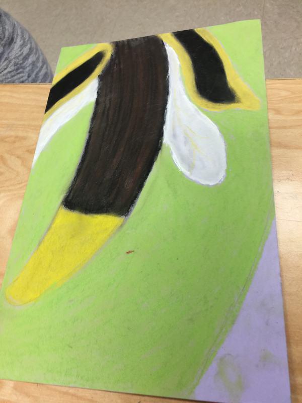
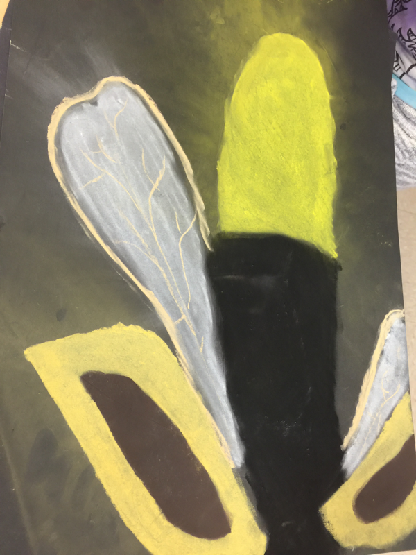
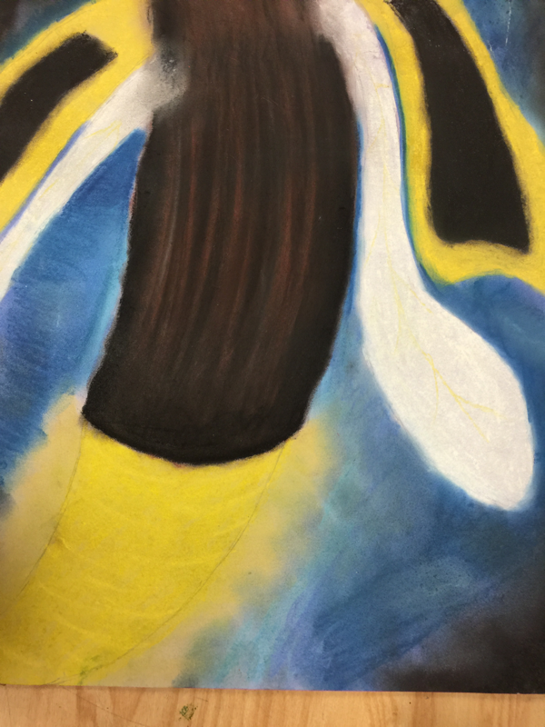
here is my close up final. I chose a lighting bug. I really like the blue background I created especially the way the colors pop due to the colored paper. O would have placed more details on the wings making them a little bit more realistic. I also should have added more the big its elfs creating more demension s
and the details that would be seen as if looked at closely Here are my many apples. Some colored pencil some water color and some chalk pastel. Out of all three chalk is my favorite, the blending is so much cleaner and well done compared to the others. With the colored pencil I like the brightness of the colors even blending with the background color chosen. Water color was fun but it's not as easy to control as the rest I would definitely prefer it on a larger scale.
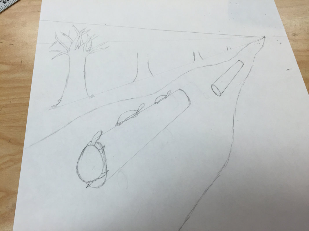
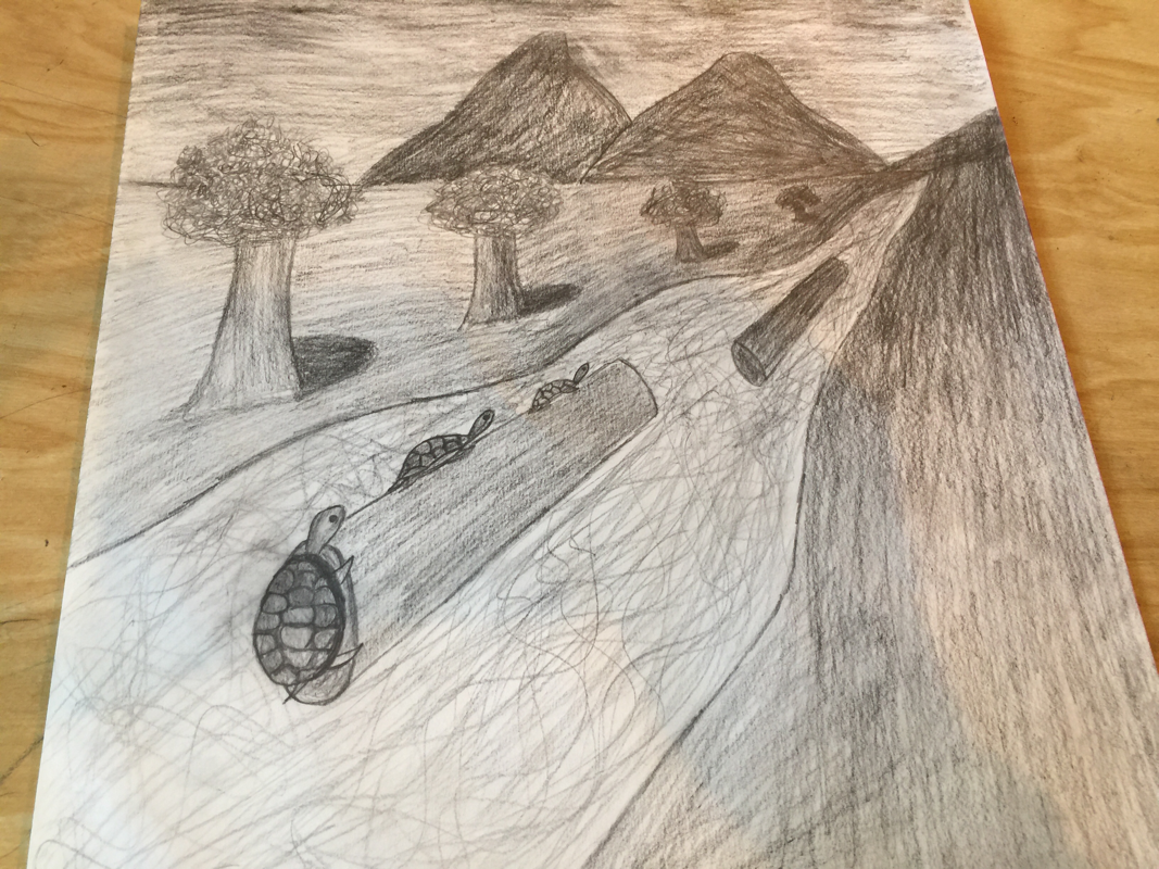
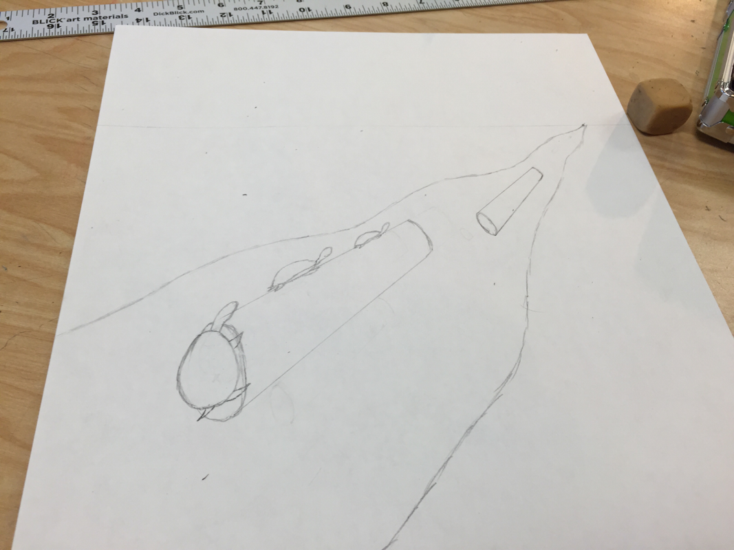
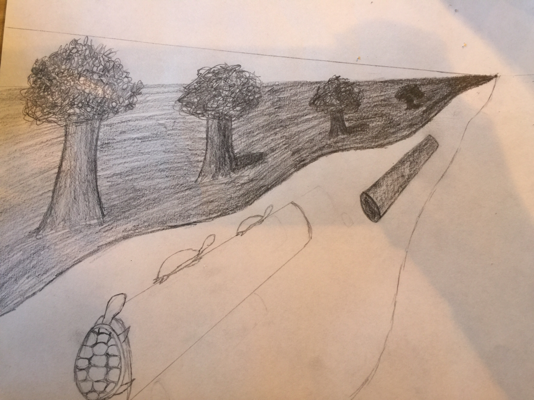
Here are my progress pictures and final of my perspective drawing. What's repeating in my image is the logs and the trees in the back round. The darkness towards the upper right corner shows how the image is going farther back and becoming smaller. I could have done better with the detail in the turtles and the logs. Also the water should be drawn in a different style. The style I chose only allows you to tell its water based on the difference in shading.
|
Authorhi :3 Archives
May 2016
Categories |
 RSS Feed
